[ad_1]
Kdenlive is one of those applications; you can use it daily for a year and wake up one morning only to realize that you still have only grazed the surface of all of its potential. That’s why it’s nice every once in a while to sit back and look over some of the lesser-used tricks and tools in Kdenlive. Even though something’s not used as often as, say, the Spacer or Razor tools, it still may end up being just the right finishing touch on your latest masterpiece.
Most of the tools I’ll discuss here are not officially part of Kdenlive; they are plugins from the Frei0r package. These are ubiquitous parts of video processing on Linux and Unix, and they usually get installed along with Kdenlive as distributed by most Linux distributions, so they often seem like part of the application. If your install of Kdenlive does not feature some of the tools mentioned here, make sure that you have Frei0r plugins installed.
Since many of the tools in this article affect the look of an image, here is the base image, without effects or adjustment:

Let’s get started.
1. Color effect

You can find the Color Effect filter in Add Effect > Misc context menu. As filters go, it’s mostly just a preset; the only controls it has are which filter you want to use.

Normally that’s the kind of filter I avoid, but I have to be honest: Sometimes a plug-and-play solution is exactly what you want. This filter has a few different settings, but the two that make it worth while (at least for me) are the Sepia and XPro effects. Admittedly, controls to adjust how sepia tone the sepia effect is would be nice, but no matter what, when you need a quick and familiar color effect, this is the filter to throw onto a clip. It’s immediate, it’s easy, and if your client asks for that look, this does the trick every time.
2. Colorize
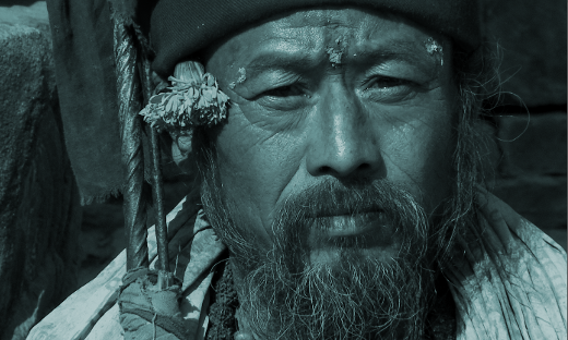
The simplicity of the Colorize filter in Add Effect > Misc is also its strength. In some editing applications, it takes two filters and some compositing to achieve this simple color-wash effect. It’s refreshing that in Kdenlive, it’s a matter of one filter with three possible controls (only one of which, strictly speaking, is necessary to achieve the look).

Its use is intuitive; use the Hue slider to set the color. Use the other controls to adjust the luma of the base image as needed.
This is not a filter I use every day, but for ad spots, bumpers, dreamy sequences, or titles, it’s the easiest and quickest path to a commonly needed look. Get a company’s color, use it as the colorize effect, slap a logo over the top of the screen, and you’ve just created a winning corporate intro.
3. Dynamic Text
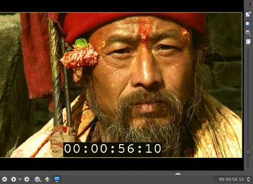
For the assistant editor, the Add Effect > Misc > Dynamic Text effect is worth the price of Kdenlive. With one mostly pre-set filter, you can add a running timecode burn-in to your project, which is an absolute must-have safety feature when round-tripping your footage through effects and sound.
The controls look more complex than they actually are.
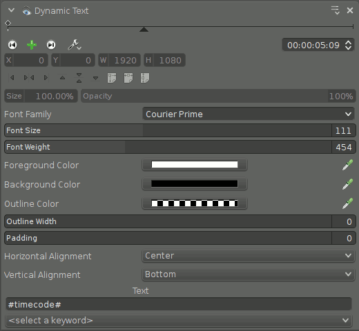
The font settings are self-explanatory. Placement of the text is controlled by the Horizontal and Vertical Alignment settings; steer clear of the Size setting (it controls the size of the “canvas” upon which you are compositing the burn-in, not the size of the burn-in itself).
The text itself doesn’t have to be timecode. From the dropdown menu, you can choose from a list of useful text, including frame count (useful for VFX, since animators work in frames), source frame rate, source dimensions, and more.
You are not limited to just one choice. The text field in the control panel will take whatever arbitrary text you put into it, so if you want to burn in more information than just timecode and frame rate (such as Sc 3 – #timecode# – #meta.media.0.stream.frame_rate#), then have at it.
4. Luminance
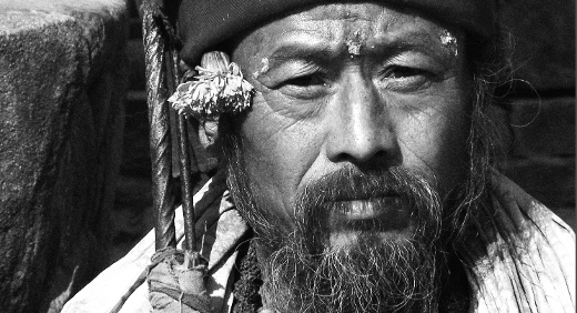
The Add Effect > Misc > Luminance filter is a no-options filter. Luminance does one thing and it does it well: It drops the chroma values of all pixels in an image so that they are displayed by their luma values. In simpler terms, it’s a grayscale filter.
The nice thing about this filter is that it’s quick, easy, efficient, and effective. This filter combines particularly well with other related filters (meaning that yes, I’m cheating and including three filters for one).
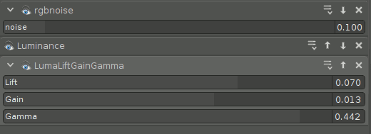
Combining, in this order, the RGB Noise for emulated grain, Luminance for grayscale, and LumaLiftGainGamma for levels can render a textured image that suggests the classic look and feel of Kodax Tri-X film.
5. Mask0mate
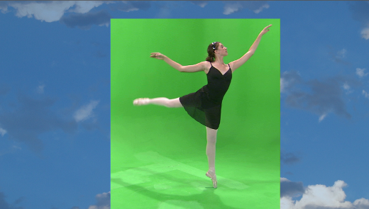
Image by Footage Firm, Inc.
Better known as a four-point garbage mask, the Add Effect > Alpha Manipulation > Mask0mate tool is a quick, no-frills way to ditch parts of your frame that you don’t need. There isn’t much to say about it; it is what it is.
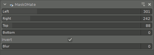
The confusing thing about the effect is that it does not imply compositing. You can pull in the edges all you want, but you won’t see it unless you add the Composite transition to reveal what’s underneath the clip (even if that’s nothing). Also, use the Invert function for the filter to act like you think it should act (without it, the controls will probably feel backward to you).
6. Pr0file
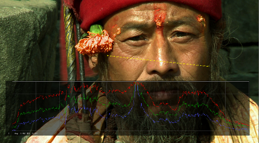
The Add Effect > Misc > Pr0file filter is an analytical tool, not something you would actually leave on a clip for final export (unless, of course, you do). Pr0file consists of two components: the Marker, which dictates what area of the image is being analyzed, and the Graph, which displays information about the marked region.
Set the marker using the X, Y, Tilt, and Length controls. The graphical readout of all the relevant color channel information is displayed as a graph, superimposed over your image.
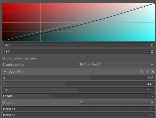
The readout displays a profile of the colors within the region marked. The result is a sort of hyper-specific vectorscope (or oscilloscope, as the case may be) that can help you zero in on problem areas during color correction, or compare regions while color matching.
In other editors, the way to get the same information was simply to temporarily scale your image up to the region you want to analyze, look at your readout, and then hit undo to scale back. Both ways work, but the Pr0file filter does feel a little more elegant.
7. Vectorscope
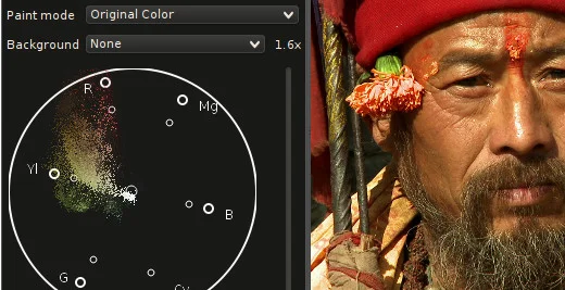
Kdenlive features an inbuilt vectorscope, available from the View menu in the main menu bar. A vectorscope is not a filter, it’s just another view the footage in your Project Monitor, specifically a view of the color saturation in the current frame. If you are color correcting an image and you’re not sure what colors you need to boost or counteract, looking at the vectorscope can be a huge help.
There are several different views available. You can render the vectorscope in traditional green monochrome (like the hardware vectorscopes you’d find in a broadcast control room), or a chromatic view (my personal preference), or subtracted from a color-wheel background, and more.
The vectorscope reads the entire frame, so unlike the Pr0file filter, you are not just getting a reading of one area in the frame. The result is a consolidated view of what colors are most prominent within a frame. Technically, the same sort of information can be intuited by several trial-and-error passes with color correction, or you can just leave your vectorscope open and watch the colors float along the color wheel and make adjustments accordingly.
Aside from how you want the vectorscope to look, there are no controls for this tool. It is a readout only.
8. Vertigo
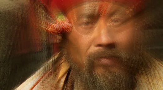
There’s no way around it; Add Effect > Misc > Vertigo is a gimmicky special effect filter. So unless you’re remaking Fear and Loathing or the movie adaptation of Dead Island, you probably aren’t going to use it that much; however, it’s one of those high-quality filters that does the exact trick you want when you happen to be looking for it.
The controls are simple. You can adjust how distorted the image becomes and the rate at which it distorts. The overall effect is probably more drunk or vision-quest than vertigo, but it’s good.

9. Vignette

Another beautiful effect, the Add Effect > Misc > Vignette darkens the outer edges of the frame to provide a sort of portrait, soft-focus nouveau look. Combined with the Color Effect or the Luminance faux Tri-X trick, this can be a powerful and emotional look.
The softness of the border and the aspect ratio of the iris can be adjusted. The Clear Center Size attribute controls the size of the clear area, which has the effect of adjusting the intensity of the vignette effect.

10. Volume
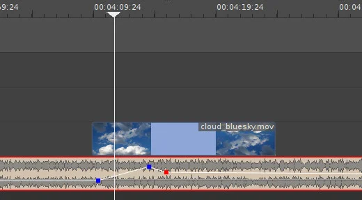
I don’t believe in mixing sound within the video editing application, but I do acknowledge that sometimes it’s just necessary for a quick fix or, sometimes, even for a tight production schedule. And that’s when the Audio correction > Volume (Keyframable) effect comes in handy.
The control panel is clunky, and no one really wants to adjust volume that way, so the effect is best when used directly in the timeline. To create a volume change, double-click the volume line over the audio clip, and then click and drag to adjust. It’s that simple.
Should you use it? Not really. Sound mixing should be done in a sound mixing application. Will you use it? Absolutely. At some point, you’ll get audio that is too loud to play as you edit, or you’ll be up against a deadline without a sound engineer in sight. Use it judiciously, watch your levels, and get the show finished.
Everything else
This has been 10 (OK, 13 or 14) effects and tools that Kdenlive has quietly lying around to help your edits become great. Obviously there’s a lot more to Kdenlive than just these little tricks. Some are obvious, some are cliché, some are obtuse, but they’re all in your toolkit. Get to know them, explore your options, and you might be surprised what a few cheap tricks will get you.
[ad_2]
Source link