[ad_1]
https://i.ytimg.com/vi/zvsRXpbPCeY/hqdefault.jpg
#bootstrap #bootstrap4 #bootstrap4grid #bootstrap4gridsystem #bootstrap4gridclssses
Hi viewers today in this tutorial we discuss on the topic is:
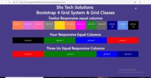
Bootstrap 4 Grid System & Bootstrap 4 Grid Classes
Bootstrap’s grid system is built with flexbox and allows up to 12 columns across the page.
If you do not want to use all 12 columns individually, you can group the columns together to create wider columns:
The grid system is responsive, and the columns will re-arrange automatically depending on the screen size.
Make sure that the sum adds up to 12 or fewer (it is not required that you use all 12 available columns).
Grid Classes
The Bootstrap 4 grid system has five classes:
.col- (extra small devices – screen width less than 576px)
.col-sm- (small devices – screen width equal to or greater than 576px)
.col-md- (medium devices – screen width equal to or greater than 768px)
.col-lg- (large devices – screen width equal to or greater than 992px)
.col-xl- (xlarge devices – screen width equal to or greater than 1200px)
The classes above can be combined to create more dynamic and flexible layouts.
Follow – Shs Tech Solutions : https://www.youtube.com/shstechsolutions
Follow On Social Media :
Facebook : https://www.facebook.com/shstechsolut…
Twitter : https://twitter.com/shstechsolution
Google Plus : https://bit.ly/2REaV5g
Original source
