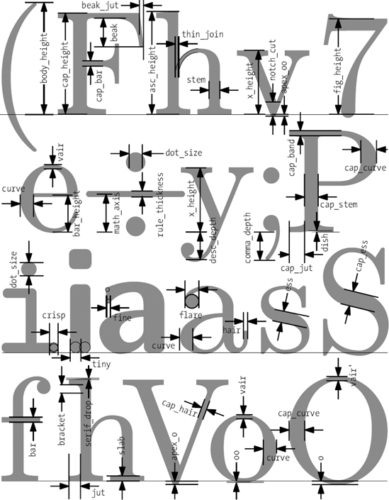
While looking for a logo for this blog I stumbled upon this great article by Alexander Alexandrov over at Amateurmedia.net. He gives you 5 guidelines that you should use when selecting a type face for your logo. I had searched high and low for just something like this tut and low and behold this is the only one worth watching as his explanations are clear and coherent, laying the principles out for even the most noooob among us (I’m noooooobest!) to understand. It definitely gave me good criteria to use when choosing a font for my logo, which I didn’t have before I started.
I highly recommend you head over to amateurmedia.net if you are looking to create a stunning logo using different typefaces.
Have fun, and don’t forget to leave a comment!
One response to “Great Article about Typography”
This is a great video