https://i.ytimg.com/vi/CzPIsbr3Yh8/hqdefault.jpg
Link for Grid system and Grid classes in bootstrap (Part-I)
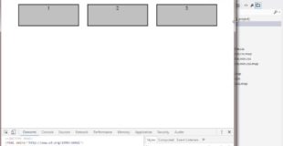
Bootstrap’s grid system allows up to 12 columns across the page.
Grid Classes
The Bootstrap grid system has four classes:
xs (for phones)
sm (for tablets)
md (for desktops)
lg (for larger desktops)
The classes above can be combined to create more dynamic and flexible layouts.
Some Bootstrap grid system rules:
-Rows must be placed within a .container (fixed-width) or .container-fluid (full-width) for proper alignment and padding
-Use rows to create horizontal groups of columns
-Content should be placed within columns, and only columns may be immediate children of rows
-Predefined classes like .row and .col-sm-4 are available for quickly making grid layouts
-Grid columns are created by specifying the number of 12 available columns you wish to span. For example, three equal columns would use three .col-sm-4
Bootstrap class Devices
.col-xs-* xs – Extra small devices Phones “less than
768px”
.col-sm-* sm- Small devices Tablets “greater than
equals 768px”
.col-md-* md- Medium devices Desktops “greater than
equals 992px”
.col-lg-* lg- Large devices Desktops “greater than
equals 1200px”
col-lg-* col-md-* col-xs-* col-sm define how many columns will there be in these different screen sizes.
Original source
