[ad_1]
The traditional workflow to edit a portrait from start to finish usually requires a few different apps. But why complicate things and not just try and rely on one single software to get to the final result? Last month I reviewed ACDSee Ultimate 10 and thought it’d be a good idea to follow up with a tutorial showing how far you can go by using exclusively this photo editing solution to retouch a portrait. Discover all my steps and see how this alternative could perhaps suits your workflow better than your current one.
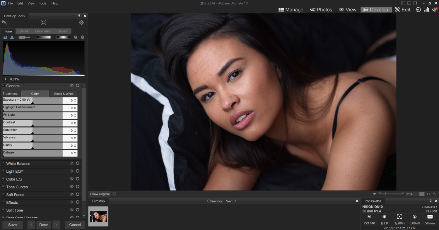
No matter what your thought process is when it comes to photo editing, the first step to get the most out of your image is to start by processing the raw file. In ACDSee, after choosing the file, we simply head over to the Develop tab and we can get to work. To keep it as simple as possible, when editing my sample file, I followed the tools in the order they are displayed.
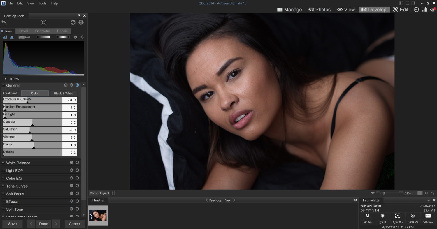
Looking at the histogram and enabling the exposure alert, I see that my highlights in the red channel are a bit too hot for my taste – I like to have them at around 200-220. So I started by lowering the exposure a tiny bit and then used the two sliders below to tone down the highlights and recover some details in the shadows. As you notice, the contrast was left untouched for the simple reason that I prefer working with curves later on if needed; it gives a far greater control than a slider does. The saturation, vibrancy, and clarity values are very much a matter of personal taste. For this set, I want to create a moody, almost cinematic, feel and look. So unsaturated was kind of obvious, and a bit of clarity simply adds more depth to the whole image.
The next tool is the white balance. However, the one I had set in camera was correct, and thus I won’t even bother adjusting anything here. But be sure to play around with it if needed. One tip is to avoid using the color picker on the teeth or white of the eyes, neither are truly white and you’ll most likely end up with a weird balance.

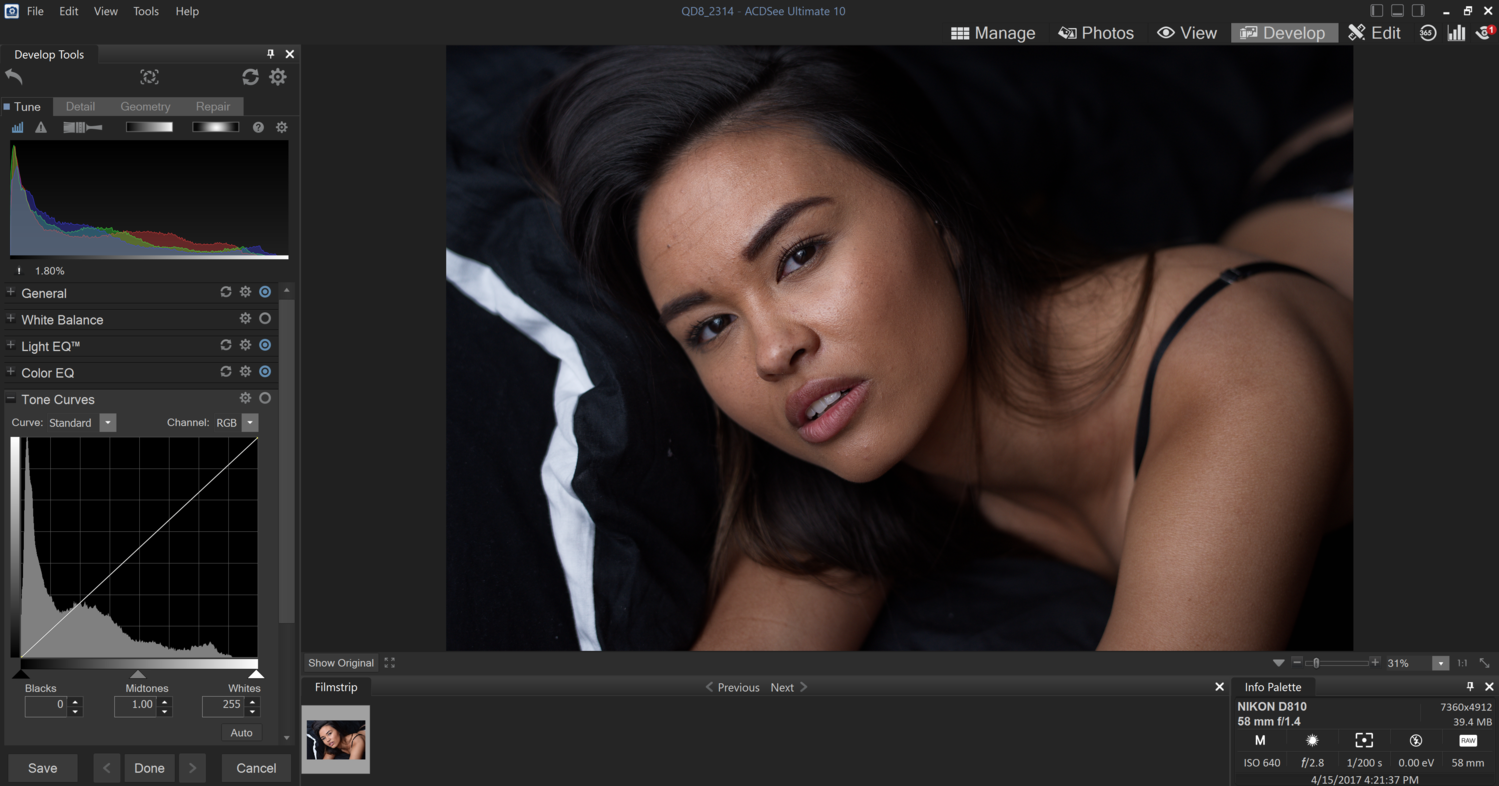
Instead, I go straight for the Light EQ which is probably one of my favorite ACDSee Ultimate 10 tools. It has a few different layout options. The Basic is close to what can be found in other raw processing software such as Capture One Pro 10 or Lightroom CC. The Advanced works very well but it’s far from being the easiest thing to understand in a pinch. Last but not least, the Standard is without a doubt the best of both world, you get the Advanced quality with the ease of use of the Basic.

The sliders above the curve will brighten the area of the histogram they are placed at, and the sliders below the curve will darken the zones. For example here, I pushed my black point down, then lighten my shadows, darken the midtones and brighten the highlights and white point. It’s kind of a parametric RGB curve, but it seems like it doesn’t affect color all that much. I’d be tempted to compare it to the Luma curve found in Capture One Pro 10 or a curve in Luminosity mode in Photoshop. However, having the sliders instead of a curve makes it easier for beginners.

Then I move on to the Color EQ, yet another powerful and handy tool. The layout can be set to High Quality for a display closer to what you may be used to in Adobe products, but otherwise, the Standard works just as well and will resemble what you find in some video software such as Da Vinci Resolve.

My goal with this tool is first to diminish any redness by lowering the red and orange saturation in the saturation tab, then give the skin more contrast by darkening the red and orange tones but brightening the yellow ones.


Finally, using the hue tab, I try to obtain more uniform skin tones by pushing the red towards the orange and the yellow as well. I barely adjusted hue as you can see and that’s because I don’t want my skin to look unnatural.

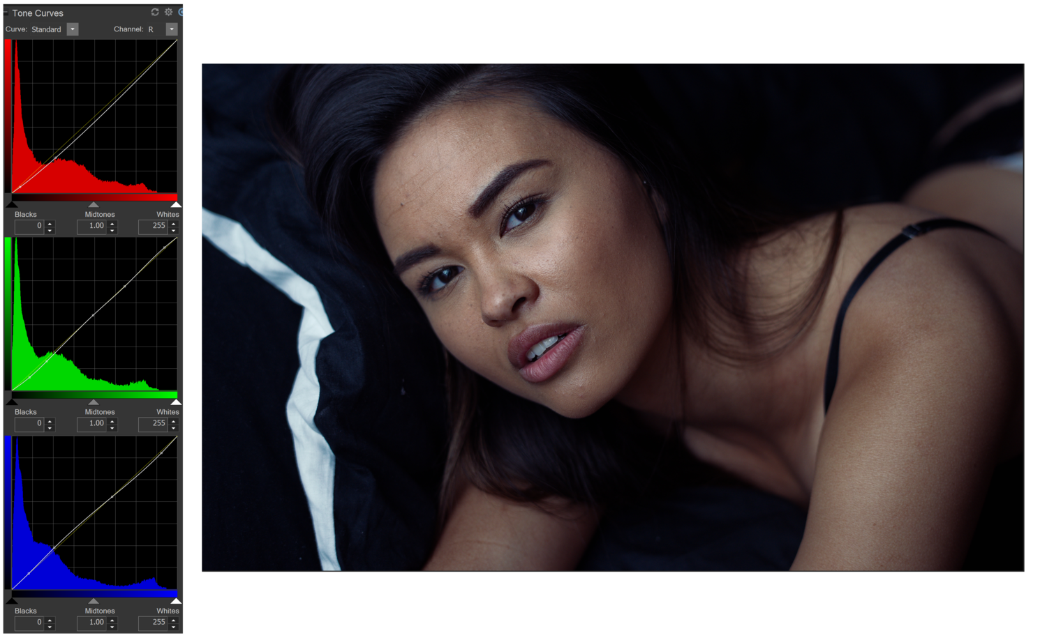
Let’s scroll down to the curve tool and set the mood of our image. The following adjustments are really up to you, but for my darker mood, I chose to go with a very cold and contrasty processing. The first step was to tone down the red by pushing the red curve down and thus have a more cyan look. The second phase was to make the skin look a bit richer by adding magenta in the shadows but then pushing some green in the highlights to give more contrast and depth. The final tweak I did was to push some blue in the shadows and add some yellow back in the highlights.
Following the list of tools, the next one should be Soft Focus. However, I’m all about natural looking texture and skin, and using this tool wouldn’t match my style. If you are all about creamy or soft looking images, by all means, play around with it but for my work, I’ll move to the Effects section instead. These are what some would call filters, and others presets. If curves are too complicated to use for you, or perhaps you feel like you could refine the current style a bit more, then they are a perfect choice. In my case, I decided to give them a try and see what I could get out of it.
I started with the Photo Effect and chose one that would strengthen the cold feel. However, at full opacity, it was way too strong and the blending mode was too flat for my taste. So I lowered the opacity and changed the blending mode to Soft Light to get a more contrasty look.

The next effect I used was Color Overlay. I used black instead of a color and switched the blending mode to Linear Light to give an intense contrast. However, it was way too intense at first, so I changed the opacity to a very low value.

Last but not least, I tried the Gradient Map to bring some warmth in the skin tones. Adding magenta in the shadows and green in the highlight, just like I did with the curves before, but then tweaking it by changing the blending mode to Soft Light and lowering the opacity.
The effects have a huge advantage over the curves as you can alter the opacity and blending mode for each of them. It makes subtle changes faster and easier, even for more advanced users.

With all these changes in terms of color toning, I decided to skip the Split Tone altogether and jump to the vignette tool right away. I added some vignette to help the viewer focus on the model’s face.

Then in the detail tab, the sharpness and skin texture of the image can be altered. However, in my case, sharpness was more than enough already and I didn’t want to use the Skin tune tool right away. Instead, I enabled the Lens Correction in the Geometry tab and cropped my image to a 4:3 ratio so that I have it ready for Instagram. I also tend to like formats close to a square better than 2:3.

Moving on to the last tab of the Develop module, I used the Repair tool in healing mode to clean any skin imperfection.

Once saved, I could now get going with the Edit tab and its tools. The choice is vast, and you can use all of these tools locally. My picture being quite close to what I wanted it to be, I didn’t use many tools here. The skin needed a bit more work, but that’s about it.

So I started off with the Skin Tune tool. I used once for the body with quite strong settings to make any rough area smoother, and then a second time on the face to attenuate any imperfection that was left. Once again, I’m all about natural skin and don’t want it to look blurry or smooth to the point that we cannot see any texture, so my picture may look a bit too rough for some of you, but you can always push the Skin Tune settings a bit more and get smoother results.

I then used the Dodge and Burn tool to correct some micro-contrast issues and smooth out some light transitions just as I would in Photoshop.

Finally, I tweaked the contrast on the whole image with the RGB curve and that’s it! I saved the final edit as a JPG, et voilà!

[ad_2]
Original Source Link