[ad_1]
Scribus is a robust open source page layout application developed with and relied upon by the open source community since 2001. According to the project’s website, Scribus is built for Linux, FreeBSD, PC-BSD, NetBSD, OpenBSD, Solaris, and the program offers CMYK colors, spot colors, ICC color management and PDF creation. The site also touts the application’s advanced features, such as vector drawing tools, support for a huge number of file types via import/export filters, emulation of color blindness or the rendering of markup languages like LaTeX or Lilypond. Coming soon is the ability to do Complex Text Layout (CTL), and to use advanced features in Open Type Fonts. The file format is XML. Scripter, a plugin to enable Python language scripting in Scribus, is part of the package.
For a quick tutorial, I’ll be building a pie chart, which will give you a decent overview of this program’s features. Scribus has some vector drawing tools built-in, but the idea of going from a list of data to a pie chart reflecting that data seemed like a major chore — a perfect job for Scripter, a scripting plug-in for Scribus.
After some investigation, I decided to look into scalable vector graphics (SVGs) as a filetype to create the charts, especially since it’s well-documented and the files are human-readable in XML. Scribus can not only import SVGs, but it can edit them once they’re imported.
I’m not going to show the entire script in this article, but will highlight three aspects: the SVG structure, the math (Caution: trigonometry ahead!), and then the Scribus part at the end.
You can find the script in its entirety on the Scribus wiki entry for making a pie chart. There are two versions there, and this particular one is at the bottom of the page.
There is also more explanation about the script there.
The SVG
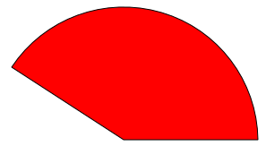
If we think of a pie chart, the data is showing us pieces of that pie, or a segment of a circle, something like this example.

The SVG command we’re interested is path. What I want to end up with for this individual segment is this:
<path d="M 200,200 l 150,0 a150,150 0 0,0 -275,-81 z" fill="red" stroke="black" stroke-width="0.5" stroke-linejoin="round" />
- What is drawing the pie segment is that expression after
d=. Mis our starting point. (It’s capitalized, which means this is an absolute position of X,Y coordinates, and this is the center of our pie.)- From there we draw a line (small
lfor relative distances from the last point) out to the edge of the circle. - The
acommand is a little tricky. This is to draw an arc, and the first component,150,150indicates the x and y radii of our circle, for an arc might be of an ellipse. - Next is
- The next
large-arc-flag. If you have 2 points on a circle, you might either take the short way around (angle less than 180°) or the long way (greater than 180°). Thus, - The last
sweep-flag, telling us we want to go counterclockwise around this circle (1would go clockwise). - Finally,
-275,-81is telling us where the end point is from where we started; so in other words, we need to know the relative Cartesian coordinates of that end point. Once we know that, thenzjust says to complete the path, connecting back to the circle center.
Hello, Trigonometry!

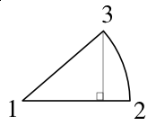
In this pie segment, we can see that we can create an imaginary right triangle, the angle at the center being the percentage of 360° that our segment corresponds to. Further, if we imagine this segment in an X,Y graph, the top point has coordinates of width-of-triangle-base, height-of-triangle, and using trigonometry,
X = cos(angle) x radius Y = sin(angle) x radiusand we have all these values, so this is where the
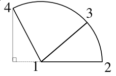
-275,-81in our previous example came from.What about the next data point for the next segment? At this point, I am going to make an executive decision. To keep things simpler, I will continue to calculate from the original starting point, in other words the X-axis of our imaginary graph.
In this diagram, I know points 1, 2, and 3, I just need the quickest way to find 4. The other decision will be to continue to draw the segments individually as closed figures, because this will help editing in Scribus, and we create shapes to fill with color.
So now it’s a matter of marching around the pie—I think I smell a Python loop of some kind, and here it is:
for n in nvalues: arc = "0" seg = n/total * 360 + seg if ((n/total * 360) > 180): arc = "1" radseg = math.radians(seg) nextx = int(math.cos(radseg) * radius) nexty = int(math.sin(radseg) * radius) L.append('<path d="M '+str(startx)+','+str(starty) + ' l '+str(lastx)+','+str(-(lasty))+' a150,150 0 ' + arc + ',0 '+str(nextx - lastx)+','+str(-(nexty - lasty))+ ' z" n') L.append('fill="'+colors[i]+'" stroke="' + bordercolor + '" stroke-width="0.5" stroke-linejoin="round" />n') L.append('<rect x="375" y="'+ str(ykey) + '" width="40" height="30" fill="'+colors[i] + '" stroke="black" stroke-width="0.5"/>n') ykey = ykey + 35 lastx = nextx lasty = nexty i += 1 L.append('</svg>') output = open(svgfile,'w') output.writelines(L) output.close()The variable
segis our accumulated arc as we go around the pie. Next, we do our calculations, with the final result being the addition of lines of SVG code to a Python list. When we’re all done, we save to a file.The Result
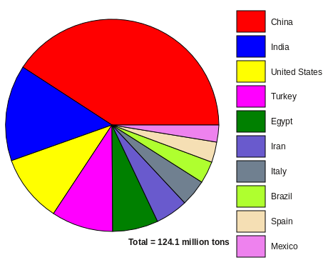
For all the tomato fans out there, this pie chart shows the relative contributions of the top 10 tomato-producing countries for 2013 (the latest year available). Something the script also does is create these color-filled rectangles on the side and the text frame showing the total amount depicted in this pie chart. Embellishments done later in Scribus were to add the units to the frame with the total, reposition it a bit, and then add a text frame for the color key.
In Scribus to line up the words and rectangles easily, make an elongated text frame next to the column of colors, typing in the words line after line. Of course, they won’t line up at first. Next, position the top of the frame so that the top word lines up with the corresponding color, then adjust Fixed line spacing in the frame until the bottom word (Mexico here) lines up with the middle of the bottom color. Line spacing can be adjusted to hundredths of a point. You are done.
When the SVG is loaded into Scribus, you will see that inside Scribus it is a Group. To edit the graphic, you will need to Ungroup, after which all the segments and rectangles are separate objects. Because it’s an SVG, you could also edit in Inkscape.
[ad_2]
Source link

