https://i.ytimg.com/vi/MlTQqO4yV-k/hqdefault.jpg
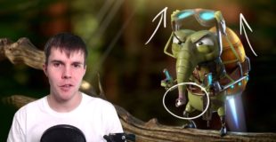
Critiquing your Blender renders. NUMBER 3! 😀
Submit your render for the next video: http://www.facebook.com/blenderguru Just post your image and include the hashtag #bgcritique
Links from the video:
How to model a car tire: https://vimeo.com/4415254 & https://vimeo.com/4422320 (my very first tutorial!)
The Secret Ingredient to Photorealism: https://www.youtube.com/watch?v=m9AT7H4GGrA
The Architecture Academy: www.thearchitectureacademy.com/sp/28053-buy-now
Understanding Composition: https://www.youtube.com/watch?v=O8i7OKbWmRM
—————————————
Follow me:
Twitter: https://twitter.com/andrewpprice
Instagram: http://instagram.com/andrewpprice
Facebook: http://facebook.com/blenderguru
ArtStation: http://artstation.com/artist/andrewprice
Blender Guru: http://www.blenderguru.com
Poliigon: http://www.poliigon.com
source

21 responses to “Blender Art Critique #3”
why would anyone want a 23 year old to nitpick their awesome renders
I gotta say that fingerprint on the Coke can, excelent detail.
I was very confused with the worm with guns, I just had to point out whoever made it has no idea what a gun is and what it does.
I hate Microsoft's tablet behavior. I don't understand how they can make it so bad unintentionally.
Shell ejection from a revolver, thats a new one :p
12:18 i think he just model that car wheel using one photo and then use reference of another car wheel
Спасибо!!!
29:23 Lol
I believe some people like to use the rule of thirds while framing, so that empty space might be an intention.
40:36 another thing is that Revolvers dont eject their shells!
I prefer the gingerbread house without all the grading, as I think the orange mimics the orange halogen lights.
Sam Lee needs to learn how revolvers work. The shell casing does not get thrown out of a revolver when shot. All the shell casings stay in the cylinders until you are ready to reload at which point you dump all 6 (or 5 or 7 or 8) empty shell casing on the ground.
330ML cans?? What sick country does that guy live in?? Amazing job with the fingerprint on the can!! I really like that little touch (pun intended, lol).
Give the worms arms? Really? That's your suggestion? I think form of the worms is the coolest part of the render.
I feel he spends too much time critiquing the artistic choices, and not enough time critiquing the modeling techniques.
I don't think that motorbike is mode in 3D, but in 2D 🙂
are you implying that people sending in images to be critiqued actually don't want to be critiqued
Personally I loved the Masoud Zamani's creature – it's just adorable!
Cannot agree on the bulking up the arms part – the character is obviously based on an insect and insects do not have thick arms. Actually those tiny little limbs make a realy nice contrast to all the rest of the body that looks quite dence.
May be what the artist could do is research how a grasshoper's or a butterfly's legs look.They start out with something like a human bicep/tricep or whatever and then they get thinner and there are also some other details to it like chipping or some sort of tiny blades – I don't know how they are called lol.
And Masoud could do the jetpack a little lighter and then those small legs would be more visible. I think the problem is that he didnt check the render in black&white in Ps while it really helps with accents
I know I'm late, but the worm dude should have one of them with a shocked face with his gun shooting out a "bang flag" and the other one smiling with the carton muzzle flash.
There are a lot of little problems with the worm render, but the worms not having human features like hands and faces is not one of them. The poses are weird, but having them pull the triggers with their tails is cool. Also, considering actual worm anatomy, these guys are wearing the hats over their faces – you could give them more character by rotating the hats 90 degrees and pointing their mouth ends toward one another.
Incidentally, they aren't actully pulling the triggers, which just worsens the lack of action. Personally I would have one worm having just fired, with the trigger all the way back, the hammer down and the muzzle flash visible and the other worm just about to fire with the trigger pulled a little way back, the hammer starting to rise and no flash. That way you get a story – a snapshot of a duel where the victor has just been decided. A bit serious for a goofy render of cowboy worms, but it's a pretty weird piece to begin with.
has he never seen a fly? the jetpack character was a fly, that's why there were six limbs and the mouth was so low. to me it made perfect sense. What I believe was the biggest default tho was the left hand holding the remote for the jetpack, i thought it was holding the gun downwards