[ad_1]
This year for Halloween, we decided to construct a witch’s workbench out on the front porch. A trip to the local op shop produced an attractive candlestick, mortar (no pestle), and a small collection of bottles. Witches are nothing if not tidy, so we figured that bottles found near a serious witch’s workshop would surely be carefully labeled. After all, one wouldn’t want to accidentally use an eye of a frog when the potion calls for an eye of newt, would one?

Luckily, we just plucked fresh eyeballs last weekend.
To create attractive bottle labels, we decided to start in Inkscape, aiming for an old printing press look. Designs that suggest old-fashioned labels are relatively simple, but the “old” part can be trickier. We figured we had two options: We could design age and erosion into the labels, or we could design the labels as new and then distress them after printing. Seth supported the first option, because he felt that consumer-grade printer ink just wouldn’t stand up to the abuse it would require to make the labels look old. As a result, Jess designed a few labels twice: once with age, and once without.
Inkscape
The bottles we had on hand dictated the size and shape of the labels we could create. Inkscape, being vector-based, is entirely impartial to measurement or size; everything can be scaled up or down as needed. Even so, there are fewer variables if you start your design out closer to your target size; this way, you get fewer surprises later on when you try to scale something and realise that your strokes are not scaling as you expected, or fonts don’t look quite as cool as you thought they did, and so on.
Art size
You can manage sizes in Inkscape in several different ways, but the two ways we do it are either: Set the canvas size to our target, or use a shape within Inkscape as a guide.
To set the canvas size:
-
Go to the
Filemenu and selectDocument Properties. -
In the Document Properties window, choose your unit of measure and enter the size you want to use as your canvas.

The canvas size has no real implication; it just serves as a guide for your design. It can be changed to something larger like Letter or A4 later, when it’s time to print.
To use a shape as a guide:
Alternately, you can create a guide for yourself with a shape. So that you guides stay out of your way, we find it best to place it on a separate layer entirely, which we hide during the print phase.
-
Go to the
Layermenu and selectLayers. This displays the Layers panel. -
In the Layers panel, click the
+button to add a layer. Give the layer a name (something likeguidelayeris sensible). -
With the Rectangle Tool, draw a box on the canvas. Don’t worry about the size, just get a box on the canvas.
-
Use the tool properties, in the
Tools Controls Baralong the top of Inkscape, to set your unit (it usually defaults to pixels, but you probably want centimeters or inches). Adjust the size (the Wand H values) to match your target. You can ignore the Rx and Ry values; they control the box’s location on the page, which you can do by dragging-and-dropping. -
Use the Fill and Stroke panel to eliminate the colour fill and set the edge stroke to suit your preference.
-
Create a new layer above the guidelayer so that you can do your design work “above” the guides.

Assets and adjustments
If you’re really good at freehand artwork, you’re free to generate a label entirely from scratch. We preferred to take a collage approach, taking elements of actual old labels that we found online, combined with bits and bobs we created ourselves.
Obviously there are plenty of creative commons and open source assets available online; far too many to link to here. More important than the links are what you can look for, because not all of it is obvious.
Fonts
Free fonts abound online, and they add a lot to the emotion you’re trying to evoke. Just as significantly, though, are the pictogram fonts providing little icons and classic symbols. There’s an old etching of a skull wearing a crown that Seth is fond of, but it doesn’t look nearly as good reduced to a tiny printed icon; Jess took the idea and ran with it, acquiring a skull and crown from a font, treating them as graphics, combining them, and in the end produced an attractive (but deadly) label graphic that you might see in a slightly anachronistic apothecary.

GIMP brushes
Given that Jess did the design work in Inkscape, you might not expect GIMP brushes to be useful, but in fact there are free sets of GIMP (and Adobe brushes that GIMP can use) brushes out there that provide amazing graphical elements like iconography, paisley, damask, and lots more.
To use them, either use them as intended in GIMP, or do some quick conversion:
-
Install a brush, open GIMP, and make a black-on-white mark with it in GIMP.
-
Import the image into Inkscape.
-
Select the image, and go to the Path menu. Select Trace Bitmap.

-
Usually the default settings are good, but add the Remove Background option at the bottom of the Trace Bitmap window.
-
Click the OK button. In the blink of an eye (really! it takes almost no time at all), it’s done. Close the Trace Bitmap window.
-
Select your image and delete it. A vector tracing should remain, which you can use and even edit.
Textures
We ended up not using textures, but that doesn’t mean you won’t. There are plenty of free textures online, which you can use as backgrounds or even embellishments. By combining text with textures, you can make your text look like pretty much any material you want, or else add paint cracks or age. As a background, a good texture can emulate anything from paper, cloth, muslin, marble, wood, or anything else.
Print and destroy
Seth had faith in our ability to mimic age and erosion digitally, but Jess felt that there was value in actual, physical erosion. Once we’d gotten designs we were happy with, we printed the labels on standard printer paper and then opened up the art kit.
We went through several iterations before we found what materials agreed with standard printer paper and ink, but ultimately we used watercolor paints for the colorful labels, and heavily reduced Twining Earl Grey tea and just a touch of ground coffee for the aged labels.

Tea, Earl Grey, hot.
The coffee proved rough on the ink, so it was used sparingly.
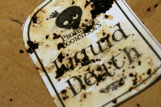
We boiled tea down from one cup to about a tablespoon and, once it cooled, dipped the labels into it. It worked like a charm.

The labels that we had attempted to age digitally ended up suffering the most from the physical materials, and we ended up with labels that were too distressed. The labels that started clean responded to the physical materials quite well, and ended up looking perfectly aged.
Mod Podge, a special crafter’s glue and sealant, was used to apply the labels to the bottles.
The results were exactly what we’d been looking for, and exactly what our witch’s workbench needed.
[ad_2]
Source link