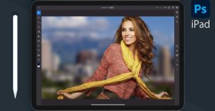
http://www.slrlounge.com/the-ultimate-lomo-photography-effect-tutorial-lomography-photoshop-video-tutorial
Lomo Photography or Lomography has gained quite the cult following in recent years. And it’s no wonder. These little Lo-Fi cameras, such as the Lomo LC-A, produce some really cool and compelling images. Aside from the Lo-Fi look of the Lomo, the other main feature of Lomography is the cross processing of the Color Slide Film.
A while back, I was trying to recreate this look on my digital photographs. However, the few tutorials I found online, while they were a start, didn’t really get me to the final Lomo look that I was trying to achieve. So, I made my own process, and now I have turned it into a full in depth tutorial for all of our SLR Lounge peeps.
We have broken this tutorial into two distinct parts. In Part I, we are going to take a look at Lomo Photography and dissect the images effects so that we know exactly how to reproduce them in Photoshop. In Part II, we are going to start Photoshopping our image from start to finish. So, if you want to get straight to the Photoshop part of this tutorial, skip to the second video.
In Part I, we identified the steps we need to turn our digital images into great looking Lomo style images. Specifically, those steps are:
Distinct Features of a Lomo Photograph
1) Cross Processed Colors
2) Increased Saturation
3) Blown Highlights/Clipped Shadows
4) Heavy Vignetting
5) Film Grain
6) Sharp Center/Blurred Edges
So, let’s get on to the good stuff and actually create our Lomo image in the Photoshop video tutorial below.
Original source

40 responses to “The Ultimate Lomo Effect Photoshop Tutorial – Creating Lomography from Digital Photography”
Create authentic looking lomo-style digital images in Photoshop! See more here: http://bit.ly/digitalLOMOtutorial
This could have easily be done in Lightroom. Faster, quicker, better.
Photoshop is overkill for basic photo adjustments.
Nice!!!!!!!
GREAT tutorials! This looks like it was shot on the hill off the 405 heading into Laguna Beach, CA. Is that where this was shot?
You can get mjojre tutorials at https://plus.google.com/117154218957469282190/posts/6fgwHeaZ44d best photgraphy information
Did you guys find out about Photo Ultimate Kits? My good friend put it to use and he has changed into a photoshop pro overnight. Search it on google.
excellent tutorial thank you
Great tutorial SLRlounge. Thank you for sharing!!
this video is amazing and so so helpful. thank you
WAOOOO
how do i get the raw options in the beginning of the video
love love the image is so classy
thanx mate, that was phat. 🙂
Great tut!! Just one thing that really bugged me through it was that you spoke about workflow and wanting to be able to go back and change something.. instead of simply merging all of the layers together (Ctrl + E), use the shortcut (Ctrl + Shift + Alt + E). This allows you to keep all the layers you have made previously, and puts the a copy of the image you see on screen above the layer that you have selected. It is such a great feature and saves me a lit of time!! 🙂
What program did you use? … excuse my ignorance …
pixlr.com
oh no download link die!!((
great content
Hi, im wondering what the font is of the text used in the intro. Anyone?
sorry, but I think it looked better before the 'lomo' effect.
F******————————— Awesome!
I agree, I liked it a bit better without the noise – but that is where your creative choice can come into play. I think I won't use the noise effect as a standard.
I really enjoyed this tutorial. Thank you for sharing, I really appreciate it!
very good tutorial m8 ty! but can i ask u a question?why do u add the noise at he end?doesn t look better without the noise?ty again m8
So much love for this tutorial 🙂 Thank you so much!
Flanders?
@sfiscpg you are correct. definitely you must have a killer software to make your clicked photos attractive. Listen to this my flickr pro friend suggested me this outstanding software to give 3d effects to your captured pics. you can also try it here >> bit.ly/IN5YfW?=yibwqk
Amazing video. I personally just got Instagram on my phone and I had taken a picture and used one of the effects on the photo. I liked the photo so much that I took another shot of the same subject with my Canon Rebel T3i. This video really helped me try and recreate the effect. The only part I am having trouble with is painting right after the lens blur. I am having a hard time finding a good balance of blur and sharp.
@dikirbaratkelate okk
Amazing editing. Thanks for sharing!
Excellent video. Well explained and easy to follow. Thanks.
thanks..i love u..no homo
best video i could find about lomography indeed ! i simply LOVE IT !
i love how you didn't miss anything ! great tips a big "THANK YOU" for the help !
why do you broke that good photo by photoshop?
Awesome and so helpful! Thank you for sharing! And you have a sexy voice too!:)
This is so good!!! I just tried it and absolutely love the effect. Thanks!!!
@PhotoshopWonder lol, I am a Persian who grew up in Utah, spent summers in Cali, now lives in Orange County and speaks Cantonese and Mandarin in the home…. I guess I talk a little funny 😉
Great help
I saw a comment on here regarding reducing the oval shape of the vignette. To control the smoothness and the oval shape, just play with the feather. The lower the feather, the less smoothed out your selection shape will be. But, keep in mind if your feather isn't strong enough, then you are going to see a clear edge where the vignette starts.
Enjoy!
Excellent, simply excellent. This is the BEST video about lomography, by far. Thanks for sharing your skills bro!