https://i.ytimg.com/vi/z6B2gt5PWdQ/hqdefault.jpg
Blender 2.8 will have new defaults for many settings. Filmic colour management will be turned on from the start, units are metric, objects will get UVs when added and much more.
Grab a Blender 2.8 preview build at http://builder.blender.org
—
Website: http://www.BlenderDiplom.com
Twitter: https://twitter.com/BlenderDiplom
Facebook: https://www.facebook.com/BlenderDiplom
The Cycles Encyclopedia: https://store.blender.org/product/cycles-encyclopedia/
Point Density Magical Effects: http://www.blenderdiplom.com/en/shop/611-point-density-magical-fx.html
source

29 responses to “Blender 2.8 Preview I New Defaults and Icons Changed Again”
Shortcut H dosent work in object mode 🙁 and everything from shortcut Z was removed ?? X-ray in bones doesn't work
3:08 OMGGGGGGGGGGGGGGGGGGGGGGGGGGGGGGGGGGG
OH NOOOOOOOOOOOOOOOO
where are the 3d icons ???????
T_T
i prefer rendering in the same blender window
When is this coming out?
Finally blender 2.80 works on my computer … 🙂 but I didn't see panel background images 🙁 There is not wireframe ?!?!? why!!!! :(:(:(
It looks free even worse than before.
Not sure if doable, but I would really like to see a performance boost in edit mode working with high poly models (translation, rotation etc.).
Blender 2.8 will put users to a new learning curve. I dislike the new user interface. it is not well thought out in its current form.
I love the new layout, the headers, icons, and settings are much more user friendly i can see more blender new comers getting used to the new ui and its hottest features. The best program in the world and its free unbelievable
Blender 2.8 will be EPIC!!!!
These all seem like small but very meaningful features… I really love all of them except for the New Window, but just change it to Image Editor and click CTRL U and voila! The default for you is now Image Editor (:
Fantastic mockery of users. Blender has a unique and original interface. Was. Now trying to mow under Maya or worse, 3d max.
I liked all of them! Tnx for de video.
Is that Troy Sobotka's Filmic?
Bad.
= Metric system have no sense. Why I should see that stupid mm and m sign every time a want to see just value?
Is it 0.0001m or 0.1mm or 0.011mmm? Scale have to be absolute EVERYWHERE, guys, to know what value I need to input.
You need to make triplanar alignation tool like 3dmatch and cad-style snap if you really want to "get real".
= I can't see overall scene load in vertices/faces/tris, so it is once again – much less control, downstep.
= Right mouse for panning layout is hardly needed, alongside with left mouse as select – as far as it is professional modeling setup.
I wasnt in a hurry to download an unstable version but after viewing this I realised I need to familiarize myself with these major changes early enough.
Overall, these new defaults are going to reduce alot of annoying friction when installing Blender, as they seem a lot more sensible than the 2.7x defaults and won't need to be changed in the startup file. Regarding renders in a new window, I also like renders appearing in the image editor, but what I don't like, is that it only appears there if you have the render result visible already, and if you don't it uses the largest 3d view window, so having them consistently appear in a new window or open render window should be nice.
Note that the new move/rotate/scale GUI buttons are not simply alternative ways of invoking GKEY/RKEY/SKEY — the are separate operators with different behaviour. This makes more sense, since the GKEY/RKEY/SKEY operators don’t work well when bound to GUI buttons, because of the way they grab the mouse.
4:52 That was the old default in pre-2.5!
1:31 Blender always gave you the choice of putting them at the top or bottom (or getting rid of them entirely); presumably you still have that choice.
Im'm just a newbie in Blender. I spent on it no more than a few hours. But I'm so happy to see that all the things I found weird in Blender (compared to my Modo and lots of other 3d application) are changing for good! Finally Blender understood that be "different at all costs" it's not so important! All these changes go in the direction of be "more similar to the other 3d application" and I love it. Blender will have more users doing this!
An example: the header at the bottom of the panel are so confusing to me! I spent so much time setting them to top! It was so strange. Finally they realize that! And immediately the interface is more logic.
ı don't like it but good
Ermm.. those new icons really exert much vital space on the UI.. 😥😥
I hate to say it, but Blender needs some good competition in open software.
There are a lot of times where we have to remodel the default UV sphere so the poles are quads instead of tri's.
Is there a particular reason everyone makes the default sphere with tri's instead of quads?
I bet if you if you make yours a default sphere with quads all the artists and modelers will love it even more.
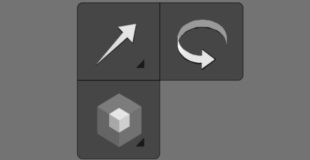
I like it all, exfept I preffered the colored icons….having them more orthographic is fine, but shapes AND color makes identifying tools faster. idc if they are super fancy so long as the colors make sense.
I think the icons should all be two-tone. It looks a little off when the main icons are one colour. Moreover the weight of both 'move' and 'rotate' don't fit against 'scale' etc. In other words the icons don't yet feel part of a unified theme as they did before the latest change. They need more work imo.
<3 mmmmm <3
fantastic so far
Makes sense, most of these are already my defaults anyway. Just saves me having to change them and make a new startup file in 2.8